Typing vs. Typography
Sometimes spending an extra half hour to an hour to get minute details right is the difference between a design studio and a really good design studio with experienced visual designers.
 Look at a bunch of websites… look closely at the space to the sides of the images. Does the content goes too close to a cover graphic? Look at the space between the letters in the main titling. It should read beautifully.
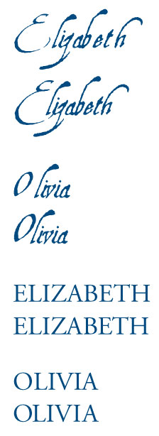
In the site I have up on my screen (and no, I won’t link — I am not into bashing, but this is pretty ubiquitous around the web — I have recreated an example here) the I and the Z of “Elizabeth” are smushed too close together. I am willing to bet that this was not a conscious decision on the part of the designer, it’s just that her name was merely typed out (and yes, colorized with a drop shadow applied). This is not design. This is typing out a name and sifting through various options to make it pretty.
In the top example here, we simply typed out ELIZABETH and OLIVIA in a super fancy font, Aquiline. This is an exaggerated example as this font’s autokerning is way off, but it illustrates the issue well. The top version is merely typed out. The bottom version allocated a bit of designer time to eyeball the space between the letters and make adjustments. And also to drop the baseline of the initial cap on Elizabeth. Doesn’t the O in OLIVIA want to come down, too? These details are all in the name of seamless design.
On the complete other side of the spectrum, with Garamond (the Roman example), a near perfect font out of the box, simply typed out is still not smooth and even (though pretty close!). We adjusted the space between the Z and the A to tighten it, and the O and the L — due to the shape of the letters those spacings need attention. And then, to illustrate where we would take it a step further, we left the gap between the A and the B alone so you can see how that feels bigger now with the Z and the A tightened — we would tighten that, too.
The point is that a good designer will notice and kern text. You might not see the gaps if you are DIY. Or if you are hiring on the cheap, the cheap designer might not have the experience to see it, or she might not have the time in her budget for additional typographical attention, even though it just doesn’t take much extra time. It’s just something to think about, because it’s a little jarring. Even if the rest of the site is okay, it’s important to note that good design is never jarring. Because while the little detail might not be noticed, per se, the feeling of not moving smoothly over the site is, and this feeling is cumulative. Those minor, seemingly jarring experiences add up. You might not be able as a viewer to put your finger on it while you are viewing a site, but it just feels unprofessional.
And that is definitely not the feeling you want to project.


